My work
A focused collection of projects I’ve built and designed.


Ishq Murshid
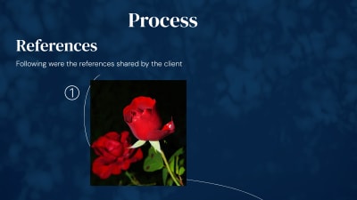
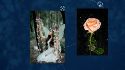
For this beautiful poetry anthology, I merged the client's vision of roses and a serene figure into a dreamlike composition that invites readers into the world of love. The design balances ethereal beauty with emotional depth, creating a cover that feels both magical and deeply personal. The soft blue-to-pink gradient and golden typography set a romantic, heavenly tone, while the composition itself becomes a visual poem—open to interpretation and rich with meaning. ### Visual Approach * The client shared references of rose photographs and a woman in a calm, magical environment. Rather than presenting these elements separately, I wove them together into a single poetic composition. * The rose petals form an organic frame that acts as a portal, drawing the eye inward to the central figure. A delicate sketch overlay adds a layer of artistic interpretation, suggesting that love itself is both real and imagined, tangible and ephemeral. * The figure—adorned with a floral crown and captured in a moment of quiet contemplation—becomes a mirror for the reader's own experiences of love. The composition leaves space for personal interpretation, allowing each viewer to find their own meaning in the imagery. ### Color and Atmosphere * The gradient from soft sky blue to warm peachy tones creates an otherworldly atmosphere—neither fully day nor night, but somewhere in between where emotions exist in their purest form. * Golden typography adds elegance and cultural authenticity while maintaining readability. The overall aesthetic is romantic without being overly sentimental, poetic without losing commercial appeal.
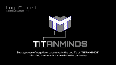
Titan Minds
TitanMinds is a brand identity designed for a conceptual modern app development company operating in the technology space. The goal was to create a logo that reflects innovation, reliability, and technical intelligence—qualities essential for a company building digital products at scale. ### The Brief: Titan Minds is a leading app development company specializing in innovative, user-friendly mobile applications. They needed a brand identity that would position them as technical experts while remaining approachable and modern. ... The brand focuses on delivering user-friendly mobile applications powered by the latest technologies. Keeping this in mind, the visual identity was designed to feel structured, confident, and adaptable across digital platforms such as apps, websites, and product dashboards. The logo is built around a custom monogram, using the initials T and M to form a unified geometric mark. Negative space plays a key role in the design, subtly integrating multiple letterforms within a single symbol to add depth and meaning without compromising clarity. A minimal color palette and clean typography were chosen to ensure versatility and longevity. The mark works effectively on both light and dark backgrounds, making it suitable for a wide range of real-world applications—from app icons to brand assets. Overall, this project explores how thoughtful geometry, negative space, and restraint can come together to create a strong, scalable identity for a tech-driven brand focused on innovation and customer trust.

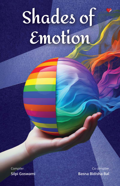


Shades of Emotion
For this poetry collection exploring human emotions, I created a visual metaphor that captures both the complexity and beauty of feelings. The sphere held in hand represents emotions within our grasp, while vibrant colors and flowing textures symbolize their unpredictable, ever-changing nature. The textured background with abstract shapes mirrors the randomness of emotional experiences, while the split design of the sphere—striped exterior meeting fluid interior—shows the contrast between emotions we can name and those that remain beautifully undefined. ### Design Concept * The textured background with its abstract shapes and proportions symbolizes the randomness and complexity of emotions—ever-changing, layered, and unpredictable. * The hand holding the sphere signifies that our emotions are in our own grasp, representing the human capacity to nurture, control, or release them. * The outer striped surface of the sphere reflects the recognizable emotions—those we can identify, label, and express clearly. * In contrast, the inner flowing textures portray the natural, divine movement of emotions—the ones that exist deep within us, often intangible and beyond conscious understanding. * The colors emerging from the sphere represent how some emotions are out of our control, affected by the world around us and the desires within. ### Execution The deep blue background creates a contemplative space that doesn't compete with the vibrant sphere. The rainbow stripes and flowing ribbons of color work together to show emotion as both structured and free-flowing. The hand reaching upward adds a human element that grounds the abstract concept, making the cover both artistic and accessible for readers seeking emotional connection through poetry.
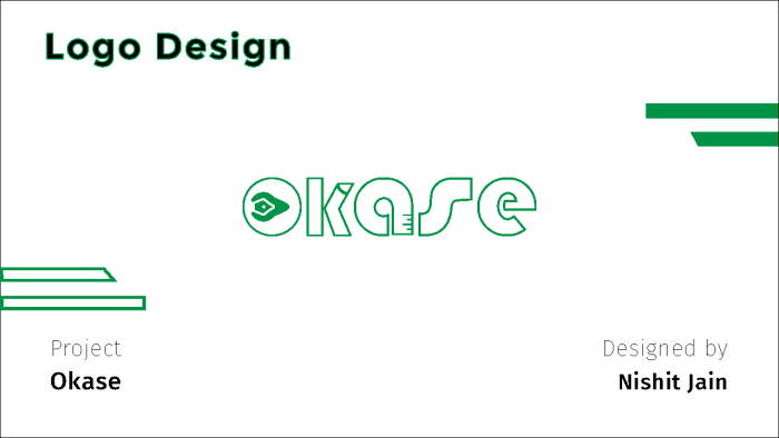
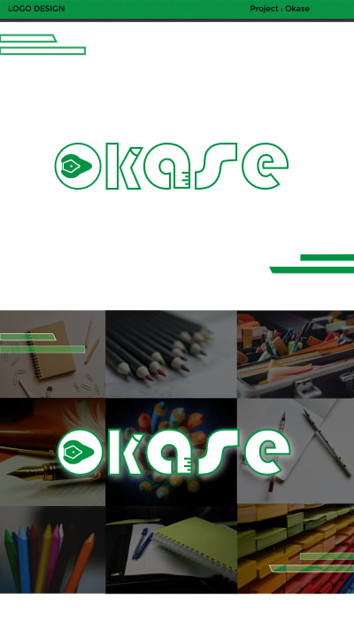


Okase Brand Identity
Logo Design and Brand identity for a stationary brand. "Okase" is a conceptual stationary brand that specializes in high end stationary products for students and artists.
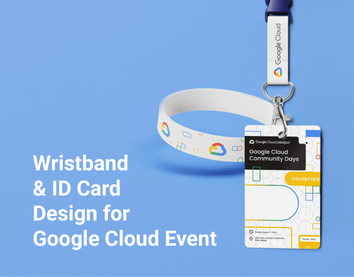
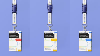
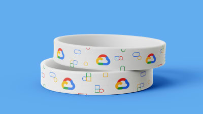

Google Cloud Community Days | Event assets Design
For Google Cloud Community Days Udaipur, I designed an ID card and wristband system that balanced brand recognition with practical constraints. The organizing committee needed a design that could be partially customized on-site due to budget limitations, so I created a system where names could be handwritten while maintaining a polished, professional look. **Design Challenge:** The event needed identification materials for multiple participant types—attendees, speakers, volunteers, and organizers—each requiring clear visual distinction. Budget constraints meant names would be added manually rather than printed, so the design needed to accommodate handwriting while still feeling intentional and complete. **Visual System:** I built the design around Google Cloud's geometric pattern language, using their signature blue, yellow, green, and red color palette with abstract shapes and rounded rectangles. This created immediate brand recognition while keeping the design light and approachable for a community event. The black header provides strong contrast and houses the event title and location, while the white central space gives ample room for handwritten names without visual clutter. Role badges in distinct colors (blue for speakers, yellow for volunteers, green for attendees, red for organizers) allow quick identification across the venue. **Practical Execution:** The geometric pattern does double duty—it fills space attractively while disguising the fact that names are added by hand rather than printed. This turns a budget constraint into a design feature that feels intentional rather than incomplete. The wristband carries the same visual language in a simplified format, using the Google Cloud icon and geometric elements to maintain brand consistency across all event materials. Both pieces are designed for standard printing and cutting, keeping production costs low while delivering a professional look that honors Google's brand standards.


The Last Clue
For this detective thriller, I created a cover that captures intrigue at first glance. The design uses puzzle pieces, shadowed faces, and a moody forest to mirror the story's core mystery: clues hidden in plain sight, waiting to be connected. The cover captures that pivotal moment when a detective knows something's just out of reach—hidden in plain sight. By layering puzzle pieces over a moody nighttime forest and the detective's contemplative expression, the design mirrors the story's core: clues waiting to be connected, mysteries concealed in darkness, and that tantalizing feeling that the answer is right there if you look closely enough. ### The Visual Strategy : * The detective's face, partially shadowed, conveys deep thought—that frustrating awareness that he's missing something crucial. His expression pulls readers into the investigative mindset. * The puzzle piece overlay works both literally and metaphorically, representing the investigation process where scattered clues must be assembled to reveal the truth. * The nighttime forest setting reinforces the thriller atmosphere while symbolizing how secrets hide in darkness, overlooked until the right perspective brings them into focus. ### Design Execution: * The color palette leans into deep blues and shadowy tones to establish mystery and suspense immediately. Bold typography ensures the title commands attention on digital shelves and in print. * The back cover extends this visual language with author photos and synopsis placement that maintains the atmospheric tension from the front. ### The Challenge This cover needed to work hard in a competitive genre—immediately signaling "thriller" to browsing readers while offering enough visual intrigue to make them pause and read more. The result is a design that doesn't just package a story, but invites readers into the mystery itself.
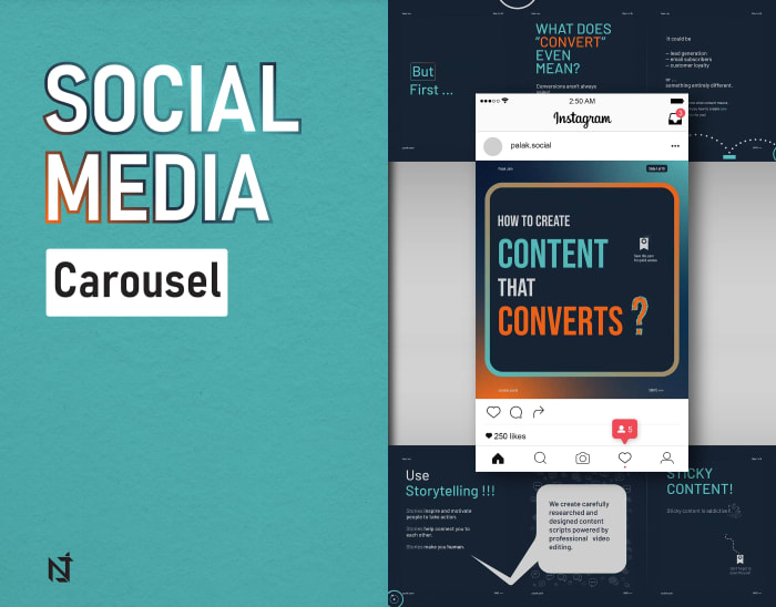

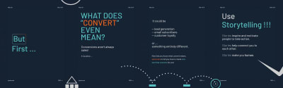
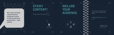
palak.social
Carousel social media designs for digital marketer.


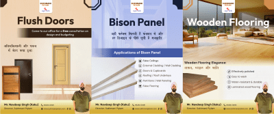
Sukhmani Plylam
Social Media posts design for Sukhmani Plylam.


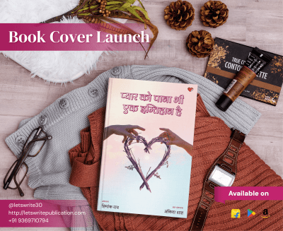

Pyaar ko paana bhi ek Imtihaan hai
Designed a soft, emotionally expressive cover for a Hindi anthology centered on love, longing, and emotional resilience ### Color & Mood - Pastel gradients and warm pink tones: to evoke tenderness, hope, and intimacy - Light, airy background: to create emotional openness and calm


Jivik Tri Fold Brochure Design
Tri-fold Brochure Design for a natural manure manufacturing company "Jivik" This is a tri fold brochure design for a natural manure manufacturing company "Jivik". The goal was to create a tri fold brochure that captures the organic essence of the brand while staying simple and non-generic.


Inward Bound
For this reflective book on self-love and inner growth, I wanted the cover to feel like a personal journal—intimate, handcrafted, and inviting. The torn paper texture adds a human touch, suggesting vulnerability and the act of peeling back layers to discover what's beneath. ### Design Approach Delicate watercolor butterflies in soft pastels symbolize transformation and the gentle journey inward. Their translucent quality mirrors the book's message about embracing imperfections and finding beauty in vulnerability. The curved "Inward Bound" text creates a visual loop, reinforcing the concept of an internal journey that circles back to self-appreciation. The muted, earthy color palette with subtle ink splatters keeps the design organic and authentic—nothing overly polished, just real and tender like the process of self-discovery itself.


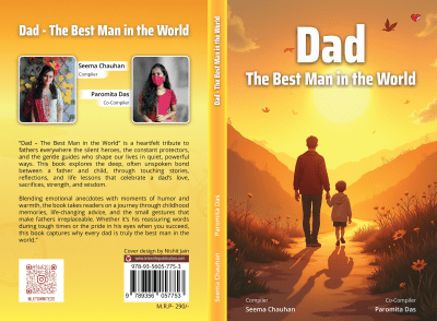
Dad - The Best Man in the World
This book about the bond between fathers and their children needed a cover that immediately conveyed connection and shared journey. The sunset palette in warm oranges and golds creates a nostalgic, comforting atmosphere that invites readers to reflect on their own father-child experiences. ### Design Approach The silhouette of a father and child walking hand-in-hand symbolizes guidance, protection, and companionship—the core themes of the book. The winding path leading into the sunset represents life's journey together, while small details like flying birds and wildflowers add life and hope to the scene. The color gradient from golden yellow to deep orange evokes feelings of comfort and cherished memories. This design speaks directly to anyone who wants to celebrate the quiet, powerful bond between fathers and their children.
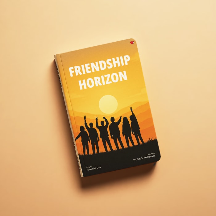
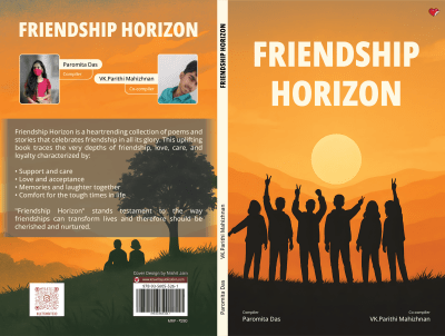


Friendship Horizon
For this anthology, the client envisioned a warm, uplifting design that captures the joy and togetherness of true friendship. The cover uses silhouetted figures inspired form the client's reference, celebrating against a sunset horizon—a simple, universal image that immediately communicates connection and shared moments. ### DESIGN APPROACH: The group of friends with raised hands in victory poses conveys celebration, support, and the carefree joy that comes with genuine friendships. The silhouette treatment keeps the figures universal, allowing any reader to see themselves and their own friend group in the image. The warm orange-to-yellow gradient sunset creates an optimistic, hopeful atmosphere that matches the book's uplifting tone. Bold white typography ensures the title stands out while complementing the positive energy of the scene. The overall aesthetic is accessible and heartwarming—exactly what readers looking for stories about friendship would want to see. An artsy, illustrated style instead of realism contributes to the comfort conveyed to the viewers at first glance


Sachaai ki Siyahi
Designed a concept-driven cover for a Hindi poetry collection rooted in raw, unfiltered emotion Visual language inspired by the metaphor of ink as truth—permanent, expressive, and impossible to hide
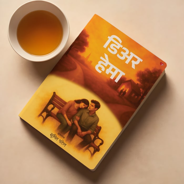
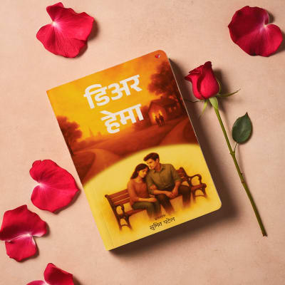
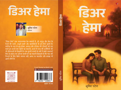

Dear Hema
For this emotional story about love, memories and communication in a relationship, I wanted the cover to feel like looking back on cherished moments. The warm orange-to-yellow palette creates a nostalgic, comforting atmosphere that draws readers into Anuj and Hema's journey. ### Design Approach The warm orange-to-golden color palette wraps the entire cover in a sense of comfort and nostalgia, reflecting the story's themes of preserved memories and rediscovered connection. Heavy Hindi typography anchors the design, giving the title presence while integrating naturally with the atmospheric scene. The upper portion shows silhouetted figures and a house at sunset, suggesting paths diverging and the passage of time. Below, a couple sits together on a bench, enclosed in a soft yellow semicircle that creates a memory-like quality—as if this moment is being recalled from the pages of a diary. The glowing backdrop adds emotional weight without overwhelming the tender intimacy between the characters. This visual structure mirrors the story's arc: the challenges that pull people apart, and the quiet moments of understanding that bring them back together. The overall aesthetic is gentle, introspective, and inviting for readers seeking a heartfelt romance about love that endures through communication.


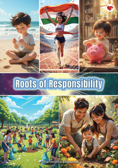

Roots of Responsibility
Designed an engaging, illustration-led cover for a children’s book focused on environmental responsibility and ethical values


Frustration
Designed a bold, emotionally charged cover for a contemporary anthology exploring modern psychological and social pressures. Visual direction focused towards discomfort, overload, and emotional fragmentation. ### Visual Strategy: * Split-face composition: to represent inner conflict and fractured identity * Hand covering the face: to express overwhelm, anxiety, and emotional exhaustion * Layered typography within the silhouette: to visualize intrusive thoughts and mental noise * Abstract paint textures: to mirror emotional chaos and lack of resolution ### Color & Mood: * Muted blues and earthy oranges: to balance emotional heaviness with urgency * Rough textures and contrasts: to reinforce tension and instability ### Design Intent: * Reflect the anthology’s themes without softening the discomfort * Create a visually striking cover that feels honest, raw, and confrontational
StudyReach
StudyReach is an online education-platform dedicated to giving learners access to world-class international study opportunities. It connects students with universities and colleges worldwide through a streamlined, end-to-end application process and a robust partner network, enabling greater choice and accessibility in higher education. ### Objective & Context The goal of the project was to create a distinctive and memorable brand mark for StudyReach-an educational-platform (or service) dedicated to helping learners expand their knowledge and reach new academic heights. The logo needed to reflect both accessibility and aspiration, conveying that the platform is supportive, forward-looking, and student-centric. ### Concept & Creative Approach The core idea behind the design was to visualize "reach" and "growth" in a simple, clean graphic form easily memorable by the target audience.


Meri Pehchaan
A symbolic, emotion-driven book cover exploring self-discovery and inner transformation—using visual metaphors of strength, solitude, and awakening to represent the journey toward one’s true identity. ### Project Objective Design a visually powerful cover that represents **self-discovery as a solitary yet empowering journey**, capturing themes of acceptance, inner growth, and personal awakening. ### Concept & Direction The client initially shared a reference of a **black swan rising from a water body**, symbolizing individuality and inner strength. I expanded this concept by introducing a **sunrise and a human silhouette**, reinforcing the idea of emergence—both external and internal. The cover treats self-discovery not as a destination, but as a moment of realization—when one finally recognizes and accepts who they truly are. ### Visual Strategy * **Black swan in motion:** Chosen as a metaphor for uniqueness, resilience, and quiet power—standing apart while moving forward with confidence. * **Sunrise backdrop:** Represents awakening, hope, and the beginning of self-realization after introspection. * **Human silhouette with open arms:** Symbolizes acceptance of the self, emotional openness, and readiness to embrace one’s identity. * **Lotus-filled water surface:** Adds spiritual depth, reflecting growth emerging from stillness and struggle. ### Color & Mood * Warm golden sunrise tones: Used to evoke optimism, renewal, and emotional clarity. * Deep blacks and soft reflections: Create contrast between inner struggle and personal strength, grounding the visual narrative. ### Typography * Bold Hindi title lettering:** Ensures clarity and authority while reinforcing the seriousness of the theme. * High contrast placement: Keeps the title legible without competing with the central symbolism. ### Design Execution * Front cover crafted for immediate emotional impact and symbolic clarity * Spine and back cover aligned to maintain tonal and visual continuity * Optimized for both print presence and digital storefront visibility ### Outcome The final design transforms abstract ideas—self-acceptance, solitude, and inner evolution—into a strong visual narrative. The cover invites readers to pause, reflect, and see their own journey mirrored in the imagery.


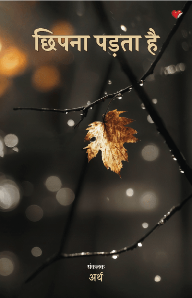

Chupna Padta hai
An emotionally quiet cover for a Hindi collection exploring solitude, self-reflection, and inner freedom.
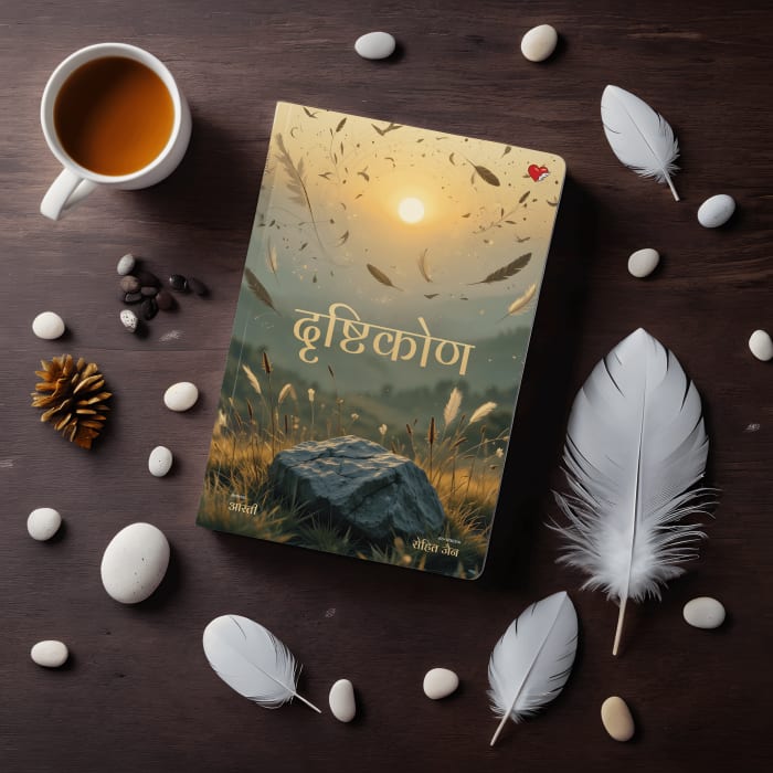


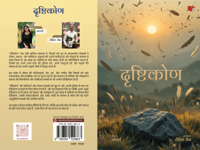
Drishtikon
The aim here was to capture that profound sense of stillness you feel sitting alone on a mountaintop—the kind of quiet that opens space for reflection and new ways of seeing. The cover invites readers into a moment of calm contemplation, where perspectives can shift and clarity emerges. ### Design Approach * The golden hour lighting creates warmth and tranquility, while the distant mountains and soft-focus background suggest the expansive view that comes with gaining perspective. The stone in the foreground grounds the composition, symbolizing stability amidst life's changes. * Floating feathers and birds add a touch of magic and serendipity—those unexpected moments of luck and wonder that shape how we see the world. The tall grass catching the light brings texture and life to the scene without disturbing its peaceful quality. * The Hindi typography sits naturally within the landscape, becoming part of the scene rather than dominating it. The overall palette of golds, warm beiges, and soft greens keeps everything harmonious and meditative, perfectly suited for a collection that explores life, society, and personal experience through poetry.